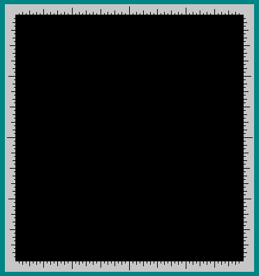
Picture segments are drawn on a canvas using a mouse or by specifying the x and y coordinates that define them. Segments may be deleted one by one or the entire canvas may be cleared.
The characteristics of picture segments are specified by controls. These controls are arranged on control cards.
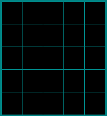
Patterns are constructed by first saving one or more pictures in an array of canvases called thumbnails. These pictures are then combined and modified in the thumbnail array using controls arranged on a control card.
Patterns may be written to or read from files.
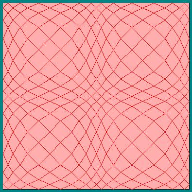
This brief tutorial demonstrates the pattern construction process by listing commands which will generate the pattern shown above. You may find it convenient to print the tutorial text prior to working the tutorial.
The second, shown below, is used to construct patterns from pictures and consists of 25 small thumbnails.
The third canvas is used to display finished patterns. An example is shown in the tutorial section above.
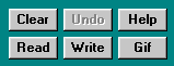
The six buttons shown above, when clicked, clear the canvas, delete (undo) the last picture segment drawn, read a pattern, write a pattern, write a gif file containing a pattern or display this help file.
The Read button cycles through the set of patterns that have been written.
The Clear button operates on the make canvas or thumbnails but not on the display. The Undo button operates on the make canvas only.
The Read, Write and Gif buttons operate on either the the thumbnails or the display but not on the make canvas. When using the thumbnails, click on the desired thumbnail canvas after clicking on the Read, Write or Gif button.
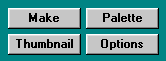
The four buttons shown above, when clicked, determine which control card and canvas are displayed.
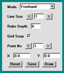
The make control card, shown above, is used to select the picture segment type (drawing mode) and the line size for those picture segments that consist of one or more lines.
The ruler depth may be changed by first selecting the text input component by clicking on it and then typing the desired value followed by "Enter". Grid snapping may be toggled on or off by clicking the check box.
It is usually preferable to set grid snapping in all modes except freehand mode.
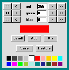
The palette control card, shown above, is used to select a color for a picture segment. Twenty colors are available for selection. These twenty colors are displayed at the bottom of the palette card. A color is selected by clicking on it. The selected color is distinguished by a black rectangle surrounding it.
A custom color may be generated by choosing its' red, green and blue components using the appropriate controls at the top of the palette card. The buttons marked ">>" increment the color values by 25, while the buttons marked ">" increment the values by 1. Similar buttons marked "<<" and "<" decrement the color values. A value may be entered directly into a text input component by first selecting it by clicking on it and then typing the desired value followed by "Enter". Color values are restricted to those between 0 and 255. The generated custom color is displayed in a rectangle below the controls.
A custom color may be selected by first including it as one of the twenty available colors. This is done by clicking the "Add" button. When this is done the first color is replaced by the custom color which becomes the selected color. The twenty colors may be scrolled to determine which color is replaced by clicking the "Scroll" button.
A continuous range of colors may be generated. This is done by clicking the "Mix" button. To generate a specific range of colors do the following. Generate a custom color to end the range and add it as the first color of the twenty available colors by clicking "Add". Then click "Scroll" to make it the last color. Then generate another custom color to start the range and add it as the first color by clicking "Add". Finally, click the "Mix button.
Color ranges may be saved by clicking the "Save" button and restored by clicking the "Restore" button. The "Restore" button cycles through the saved ranges together with the original range of default colors.
Press the mouse button on the canvas to define the start point of the line, then drag the mouse and release the button at the lines end point.
Press the mouse button on the canvas to define a corner point of the rectangle, then drag the mouse and release the button at the rectangle's opposite corner point.
The size and position of an oval is defined by its' enclosing rectangle. Press the mouse button on the canvas to define a corner point of this rectangle, then drag the mouse and release the button at the rectangle's opposite corner point.
Click the canvas to define the first point and then drag the mouse releasing the button at each subsequent point. Finally, close the polygon by selecting the first point again. The program will consider the polygon closed and finished when a point within five pixels of the first point is selected.
Curves are defined by four points, the curve's start point and end point and two control points. To specify the start and end points, simply click on the canvas. A dotted line will then be drawn between these two points. Next, define the shape of the curve by dragging each of the control points using the mouse. One control point is moved by the mouse normally and the other control point is moved by the mouse with the SHIFT key held down. Be careful to hold the mouse button down when defining the curve's shape releasing the button only when the desired shape is shown by the dotted outline. If the SHIFT key is down when the desired curve is obtained, be careful to release the mouse button before releasing the SHIFT key.
Curved shapes may be filled with color by drawing two filled curves with the same start and end points.
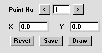
The bottom section of the make control card, shown above, is used to specify the x, y coordinates of picture segments directly. This method is less convenient than using the mouse, but allows a more accurate specification of the shape and position of a picture segment.
Coordinates are >= 0 and <= 1. The top left corner of a canvas is specified as (0, 0), the bottom right corner is specified as (1, 1) and the center is specified as (0.5, 0.5).
A line is defined by two coordinate pairs specifying its end points. A rectangle is defined by two coordinate pairs specifying the top left and bottom right corners. An oval is defined by specifying its enclosing rectangle. A polygon is defined by specifying the coordinate pairs of each of its points. A curve is defined by specifying the coordinates of its end points followed by the coordinates of the two control points. Finally, a freehand segment is defined by specifying the end points of a sequence of connected lines.
Coordinates are specified by first selecting a point number, then entering both the x and y values and finally clicking the Save button. The point number and coordinate values are typed into the relevant input control followed by "Enter". The point number may be incremented or decremented by clicking the associated buttons. This provides a convenient means of checking and editing the values of the coordinates. When checking the coordinates, note that the last point number is not part of the specified point set. It provides a means of adding a new point. To delete all specified coordinates click the Reset button.
When a picture segment has been specified and checked, it may be drawn by clicking the Draw button.
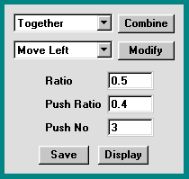
The thumbnail control card, shown above, together with the thumbnails are used to construct patterns from pictures and other patterns.
To combine patterns, first select the desired operation using the combine choice component and click the Combine button. Then click, in turn the thumbnails to be combined and finally click the thumbnail to hold the combined pattern. The following operations are available:
To modify (move, rotate or reflect) a pattern, first select the desired operation using the modify choice component and click the Modify button. Then click the thumbnail to be modified and finally click the thumbnail to hold the modified pattern. The following operations are available:
The ratios and push number may be changed by first selecting the associated text input component by clicking on it and then typing the desired value followed by "Enter". The ratio values are restricted to 0.0 <= value <= 1.0 and the push number values are restricted to 1 <= value <= 25.
It is instructive to make a picture consisting of a white rectangle with a red spot in one corner and use it to try various combinations, modifications and options. Such a picture is included in the example patterns.
To save a picture contained on the make canvas, first click the Save button and then click the desired thumbnail.
To display a pattern, first click the Display button and then click the thumbnail to be displayed.
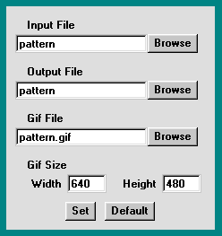
Options are specified using the options control card shown above. These options specify the files used by the read, write and write gif file operations. These operations are controlled by the Read, Write and Gif buttons described above.
Normally saved patterns are contained in a single file. The read operation cycles through the file, returning to the beginning when the end is reached and the write operation appends patterns to the end of the file. To edit pattern files, two distinct files are specified, one for the read operation and one for the write operation.
The name, width and height of a gif file may also be specified.
Files and file sizes are specified by typing the name, path or size into the relevant text input component followed by "Enter". When all the options are as desired, click the Set button. Click the default button to reset all options to their default settings.
Browse buttons are provided to allow browsing within the directory structure. A file explorer dialog, shown below, is provided for this purpose.
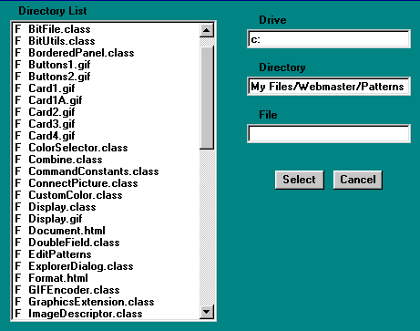
File browsing is accomplished by double clicking the directories and files displayed in the directory list component or by typing the drive, directory path or file name directly into the text input components provided, followed by "Enter". Directories and files in the directory list component are distinguished by a leading "D " of "F ". Entries marked "D .." are used to return to parent directories.
When the desired file has been identified, click the "Select" button. To cancel file browsing, click the "Cancel" button.